Monday, March 8, 2010
Logorama - The movie
Saturday, August 22, 2009
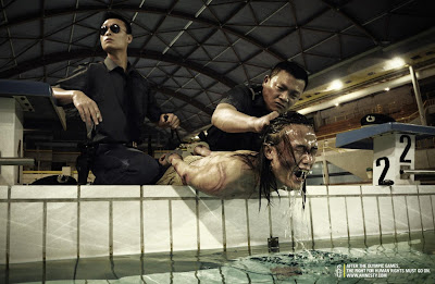
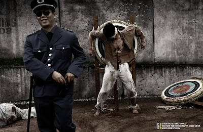
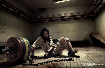
Time Machine #3


After the Olympic Games, the fight for human rights must go on.
Advertising Agency: TBWA\Paris, France
Executive Creative Director / Creative Director: Erik Vervroegen
Copywriter: Benoit Leroux
Art Director: Philippe Taroux
Photographer: Marc Gouby
Art Buyer: Barbara Chevalier
Account Supervisors: Anne Vincent, Tiphaine Ruault du Plessis
Friday, July 24, 2009
Redesigning a logo - The Pepsi case
The only thing I don’t agree with is the way that the logo changes from the regular Pepsi to the light Pepsi. You can’t have two logos, even though the idea of making a thinner element for a light product is interesting. But they could have done this with the can, for example. Not with the logo.
Check out the Pepsi logo evolution below, and some other interesting examples of logo redesign.


Monday, July 13, 2009
Creative business cards
 Advertising Agency: Leo Burnett, Toronto, Canada
Creative Directors: Judy John, Israel Diaz
Art Director: Paul Giannetta
Copywriter: Sean Barlow
Photographer: Mark Zibert
Released: February 2009
 Advertising Agency: Fischer Portugal, Lisbon, Portugal
Creative Director: Diogo Mello
Art Director: Marco Martins
Copywriter: Rafael Pitanguy
Released: March 2009
 Advertising Agency: Marked for Trade
Creative Director / Art Director: Phil Jones
Copywriter: Ryan Coleman
Photographer: Jeff McCullough
Released: December 2008
 Advertising Agency: BBDO Bangkok, Bangkok, Thailand
Creative Directors: Suthisak Sucharittanonta, Nikrom Kulkosa, Vasan Wangpaitoon, Juntiga Nasunee
Art Directors: Keatnapin Sobhinnon, Nikrom Kulkosa, Vasan Wangpaitoon
Copywriters: Phairat Uaphadunglert, Juntiga Nasunee, Suthisak Sucharittanonta
Illustrator: Sinothai Samseethong
Photographers: Settaphan Rummanee, Nuth Rungruang
Published: March 2008
 Advertising Agency: DDB, Milan, Italy
Creative Director: Vicky Gitto
Art Directors: Aureliano Fontana, Cristina Marcellini
Copywriters: Valerio Le Moli, Bruno Vohwinkel
Thursday, July 9, 2009
10 principles to keep in mind when creating an ad
Very interesting tips for advertisers around the world. This article is a little old, but it's still very useful. Maybe that's the beauty of it.
1. No one cares about your company.
You might be intimately familiar with your product or service. You might even love it. But your audience doesn’t. Your ad has to give them a reason to care. Consumers don’t think in terms of features and benefits. Those are marketing terms. Consumers want something that will make their lives easier or bring them success. How will your product or service do this? More importantly, how will your ad convince them it will?
2. Don’t let fear motivate you.
One of the biggest mistakes you can make is to second-guess your audience’s ability to understand. Think of Goodby, Silverstein & Partners’ “Got Milk?” campaign. The entire message is based on the absence of milk. Without picturing milk in a variety of scenarios, the agency created a world without milk. If somewhere along the line, the California Fluid Milk Processor Advisory Board (the client) had rejected the no-milk concept because it didn’t adequately promote the product or make milk “the hero,” the resulting campaign would have been very different. And probably far less memorable.
3. If it works on you, it will work on them.
You are a consumer. You read ads and buy things. If your ad doesn’t convince you, chances are it won’t convince your audience.
4. Talk about one thing.
Volkswagen once ran an ad whose headline read: “It makes your house look bigger.” The message was simple: VW Beetles are small. The headline didn’t mention the car’s gas mileage, price, or engineering. It didn’t even mention VW. It got people to think small is good.
5. Say it differently.
Take the one thing you want to communicate and come up with different ways to say it. In the VW example above, the headline didn’t say “VW Beetles are small.” Think of ways to state an ordinary message in an unusual way so that it gets attention.
6. Let your audience draw their own conclusions.
When Steven Spielberg first screened Jaws, the audience laughed at the shark. His solution? Remove the shark. In the end, you see the entire shark in only a few scenes. But the movie is still terrifying. The same principle applies to advertising. Don’t be afraid to let consumers draw their own conclusion about your company or product. The conclusions we make for ourselves are usually the most powerful.
7. Make design and copy work together.
The headline and image tell the story. Don’t let the visual design overpower the message. And don’t rely on copy alone to convey the entire idea. A headline should never tell you what is in the picture. And graphic design should never be used merely to fill space.
8. Create an emotion.
The worst thing an ad can do is be boring. A series of physiological events occurs when we’re happy, sad, entertained, or angered. Use this to your advantage. Make sure you generate a response in the person looking at your ad. Any response is better than no response.
9. Sell something, don’t just talk.
Imagine this: You’re looking for a new car. You have one in mind. You arrive at the dealership, see the perfect car on the lot, and go inside to inquire about it. Instead of answering your questions, the salesperson launches into a history of the car dealership. Do you care? In advertising, always stay focused on what you’re selling and anticipate the consumer’s needs.
10. Make them respond.
The best ads demand a response. They make consumers want to act. Always give your audience a reason to act and the means for doing so, whether that’s a phone number, fax number, or web address.
To read the full article, click here
via Ad Age
Wednesday, July 8, 2009
Saturday, July 4, 2009
The bleeding billboard
Photographer: Steven Boniface
Executive Creative Director: Nick Worthington
Art Director: Emmanuel Bougneres
Copywriter: Nick Worthington
Agency Producer: Paul Courtney
Producer: Rollercoaster Design
Account Director: Scott Coldham
Senior Account Manager: Janelle Van Wonderen


